Core Collection designs:

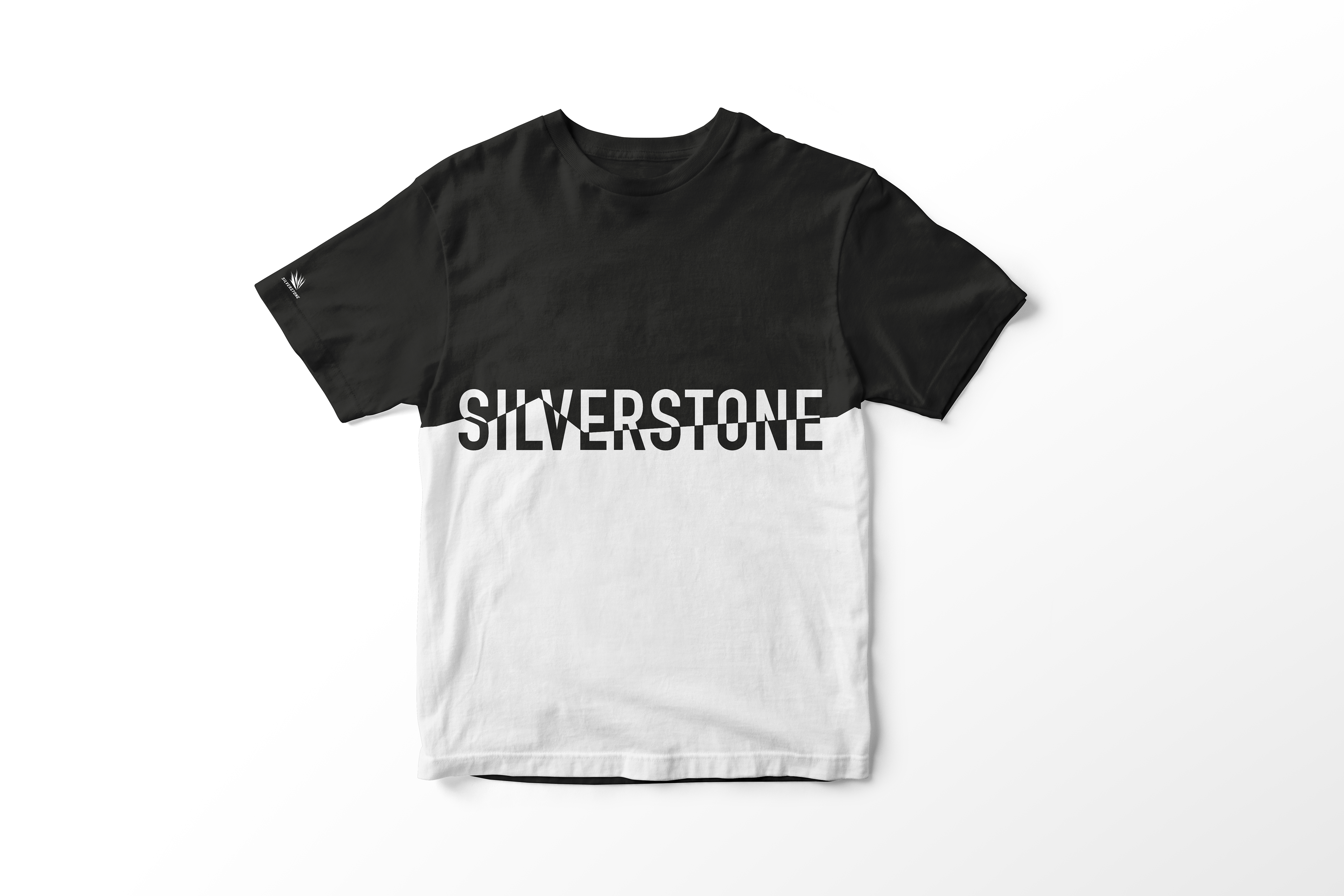
This design features the outline of The Wing at Silverstone, and the line creates a two-toned t-shirt. This could be developed further to having a divide of other colours in Silverstone’s colour palette. The back features all the names of the circuit corners.
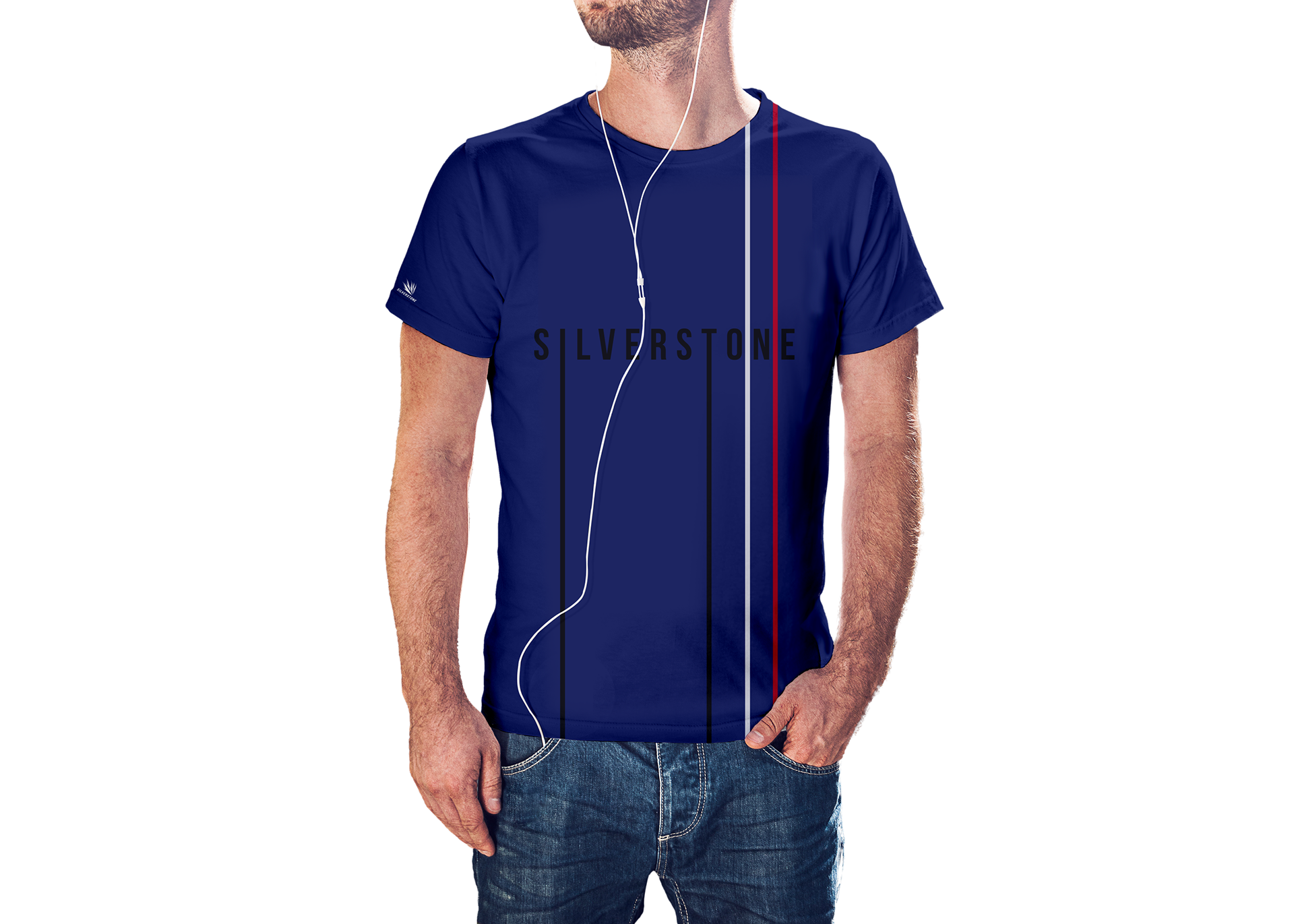
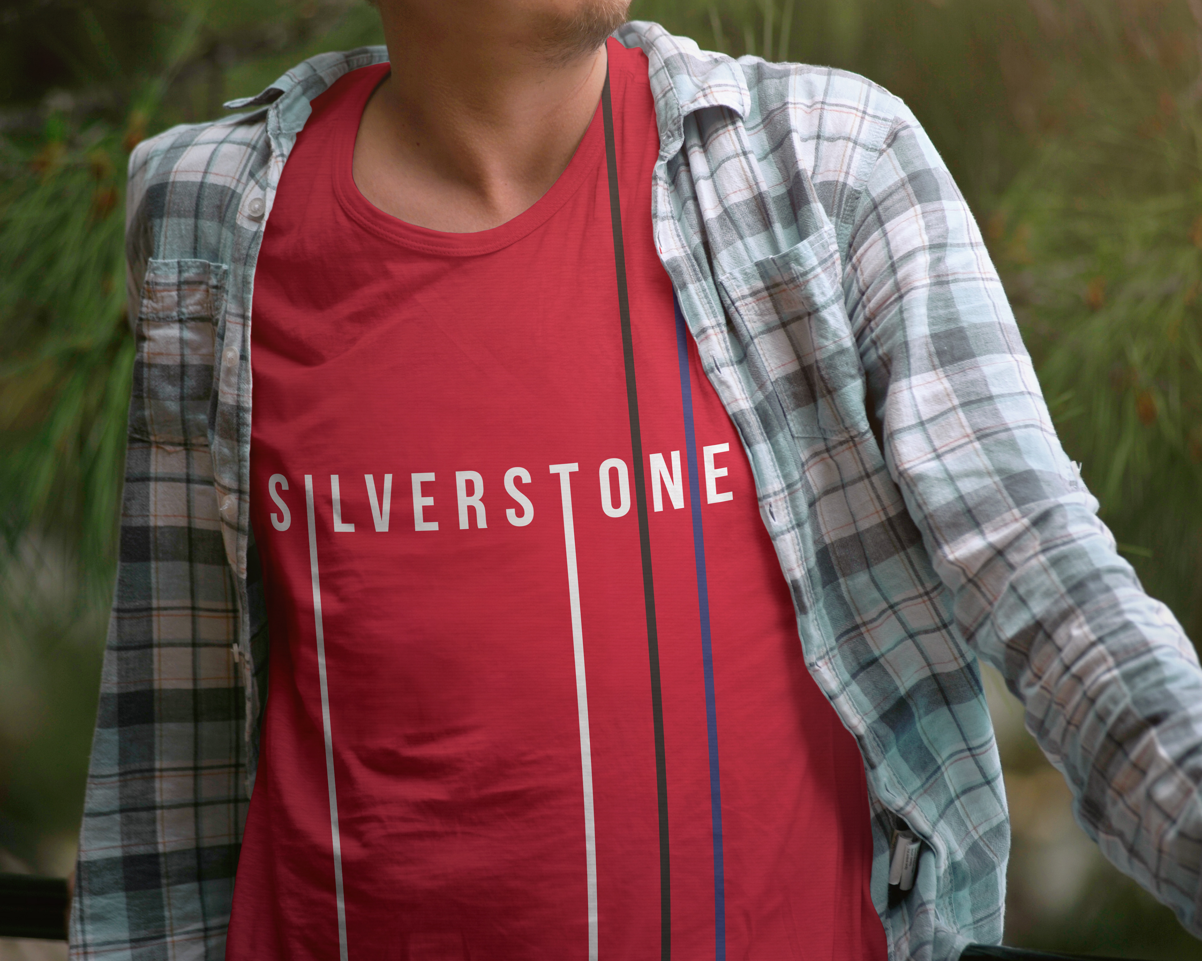
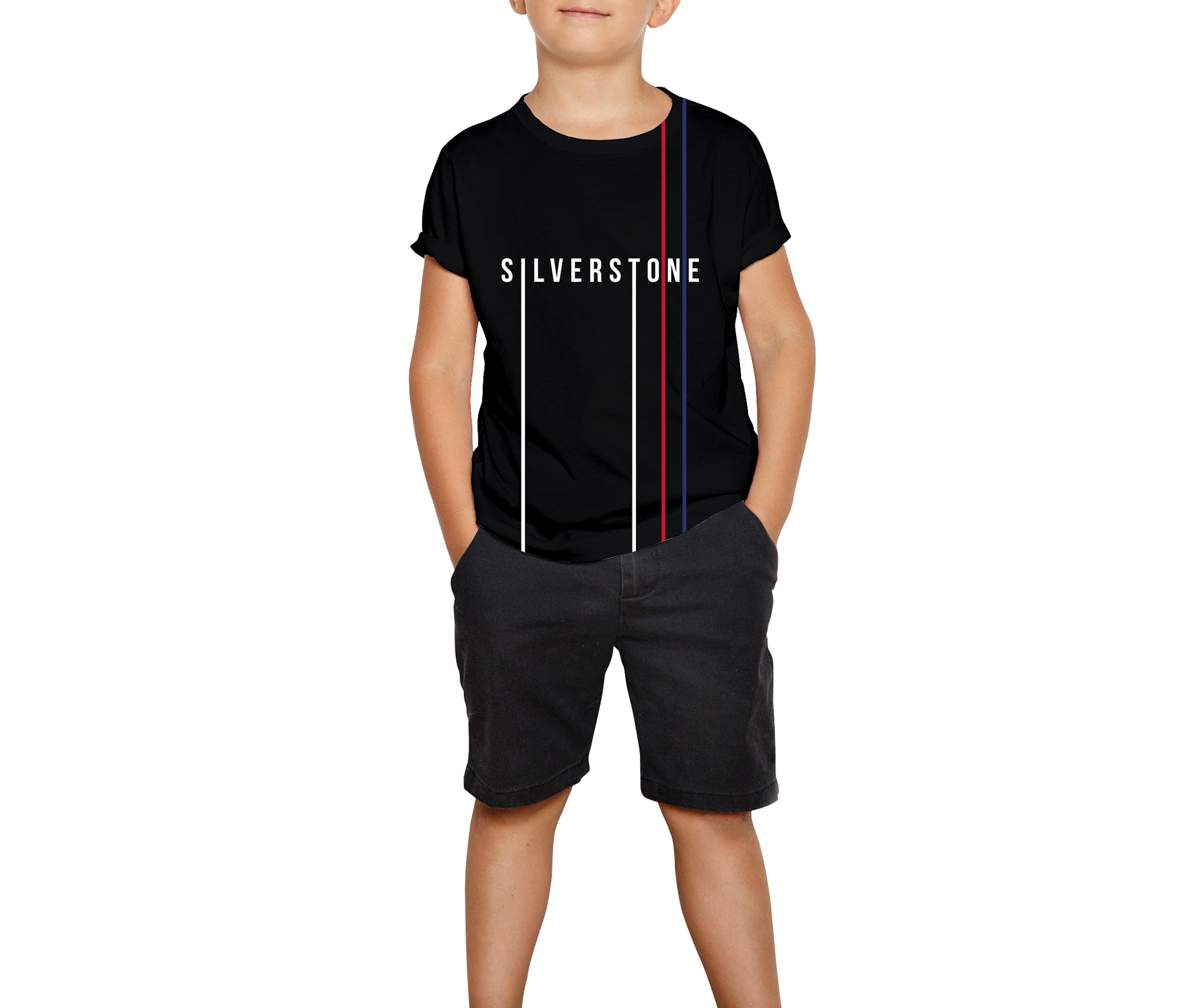
I created this simple design, using variations of the Silverstone colours and lines. Extending the ‘S’ and ‘T’ created lines relating to the Silverstone track and the addition of the two lines on the right could represent brake marks . Altogether, the print is fashionable and responds to the high-street wear the client was looking for.
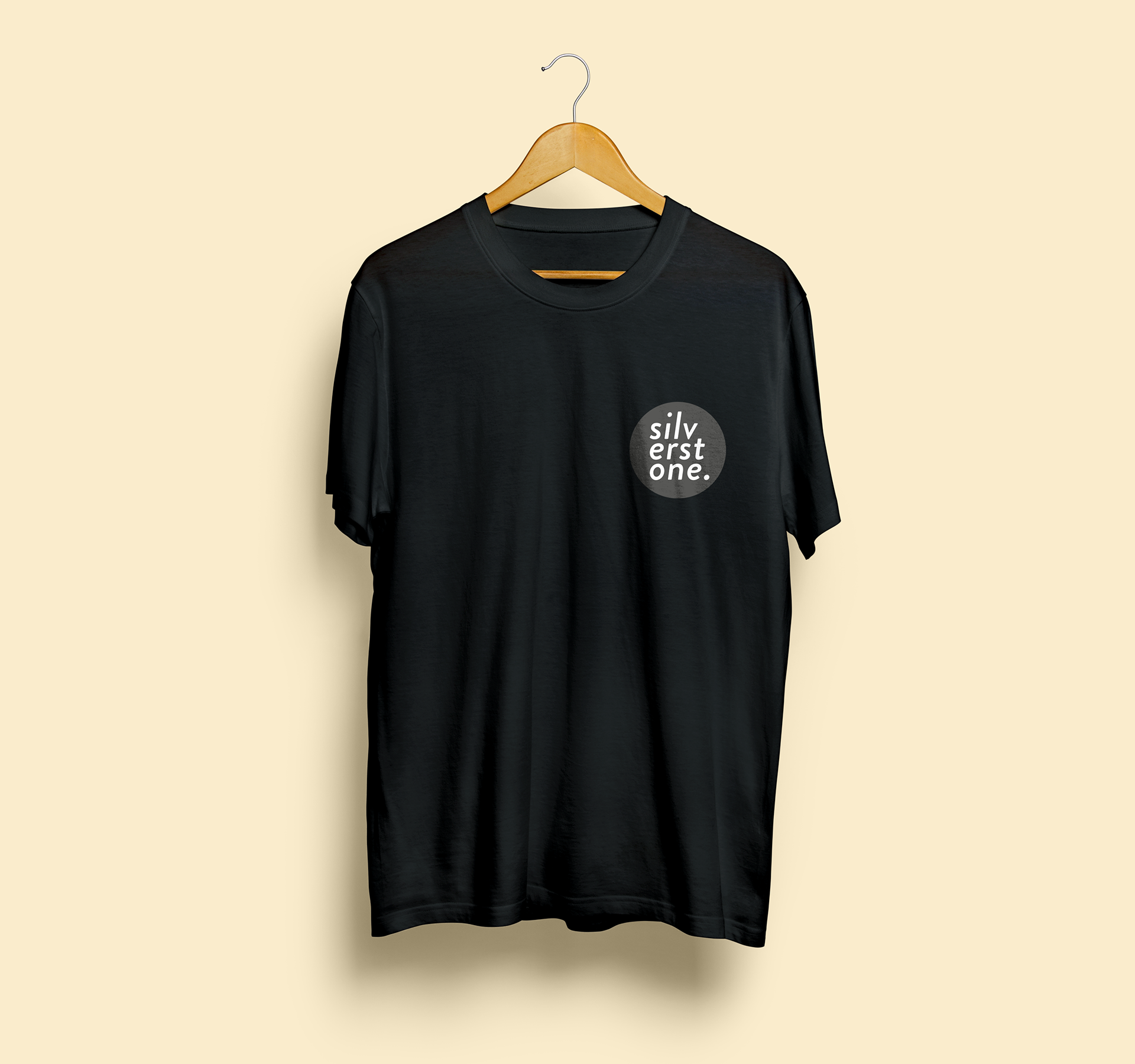
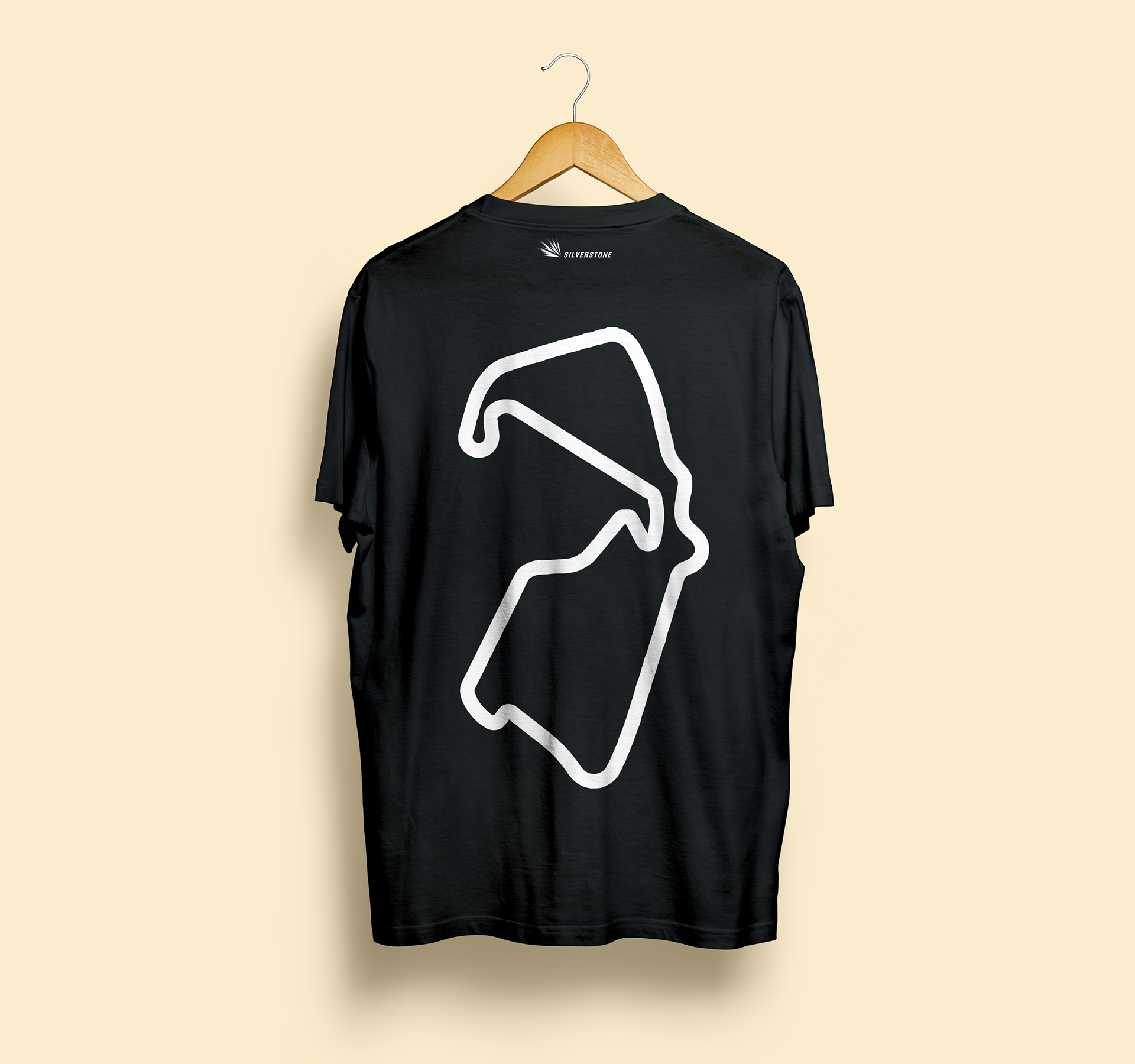
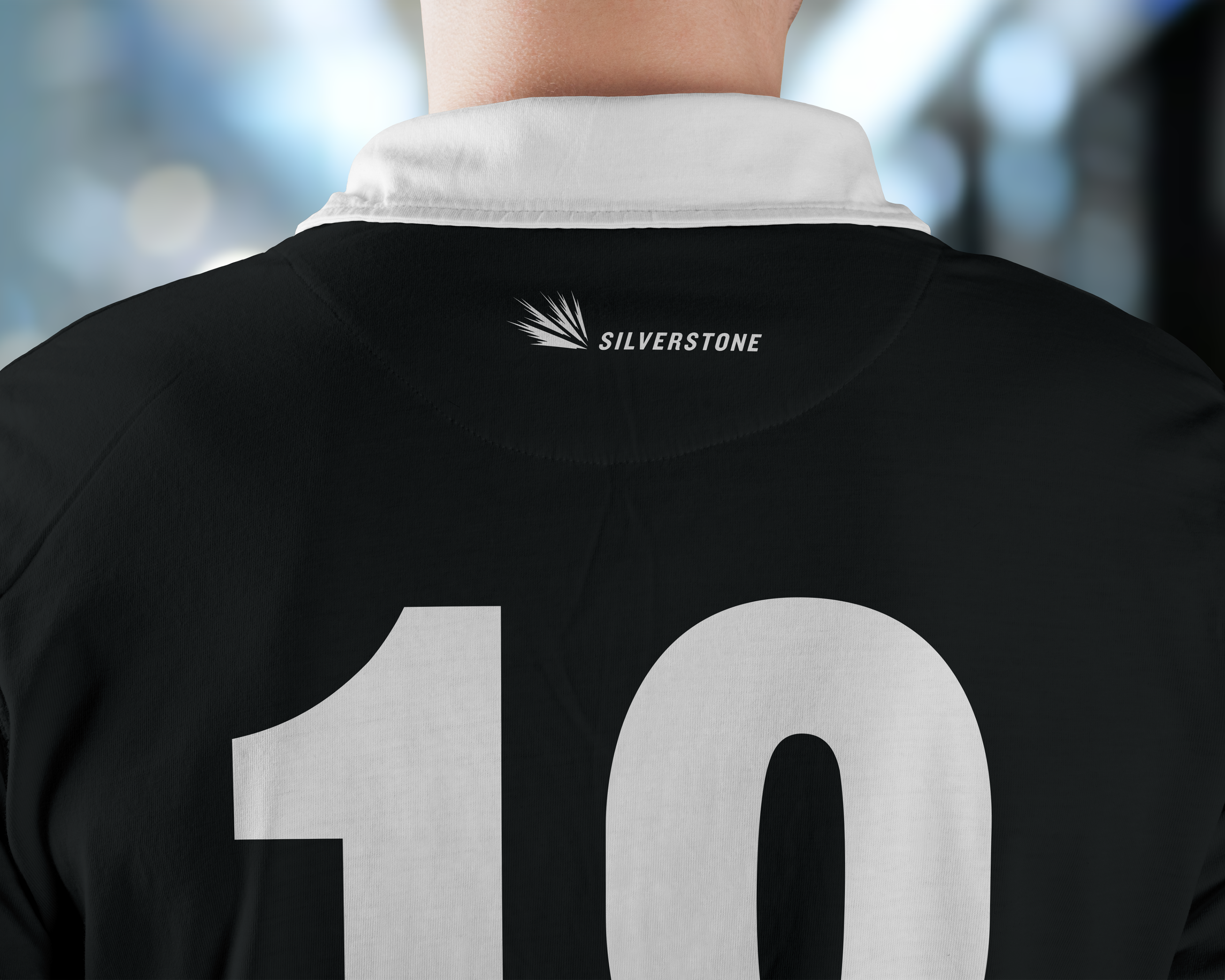
This design was compatible for both the Core range and the Grand Prix range (below). The Core range features a simple badge on the front and the Silverstone circuit printed on the back.
Grand Prix 2018 designs:
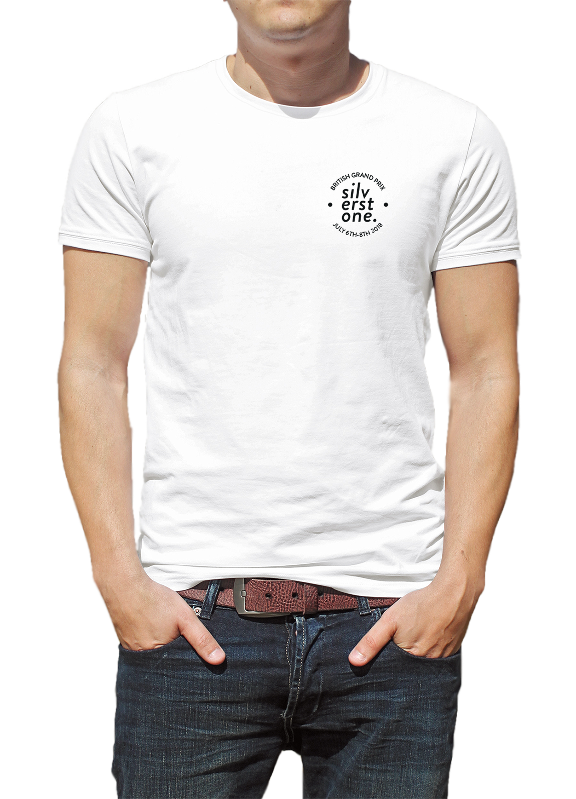
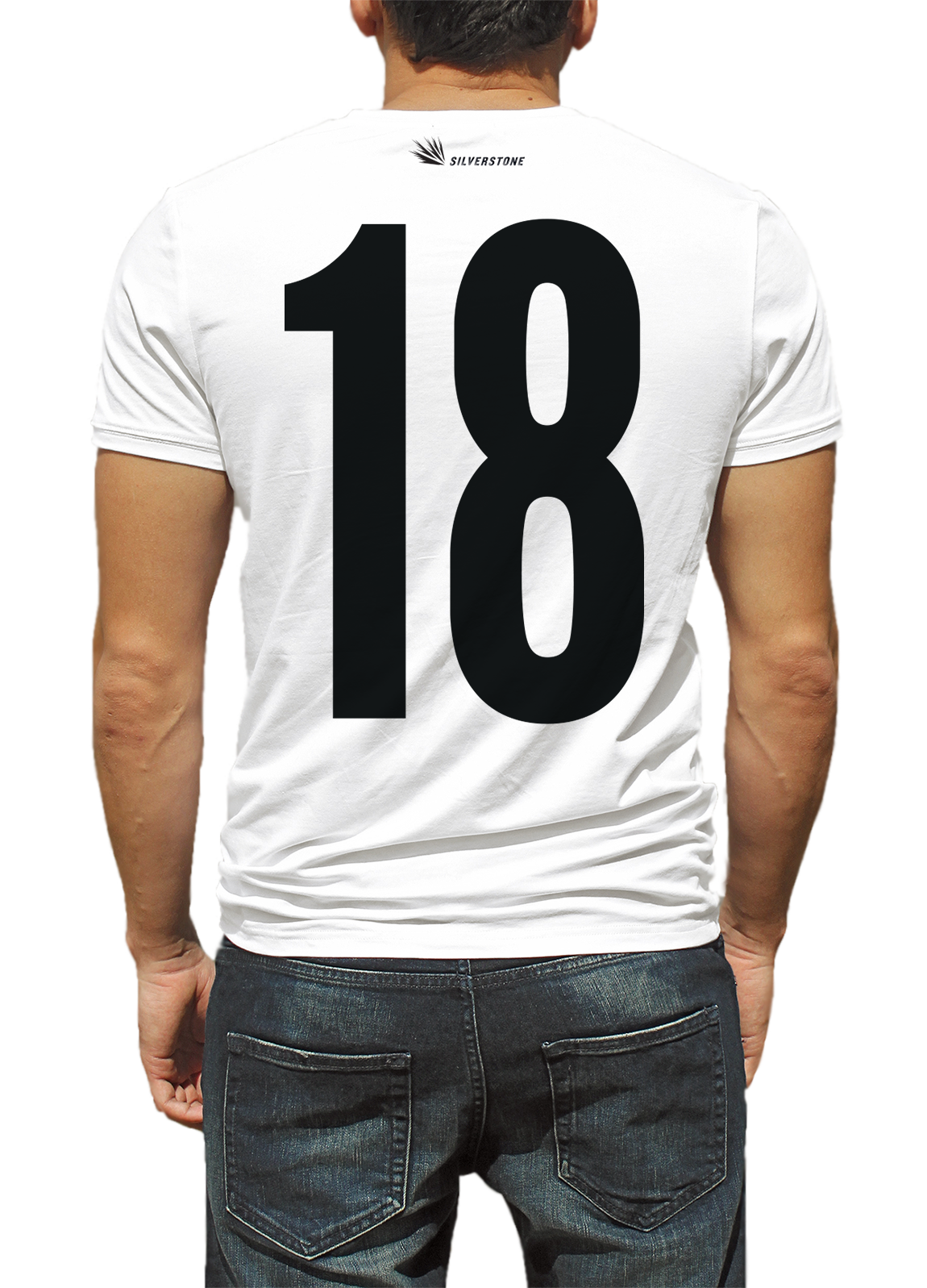
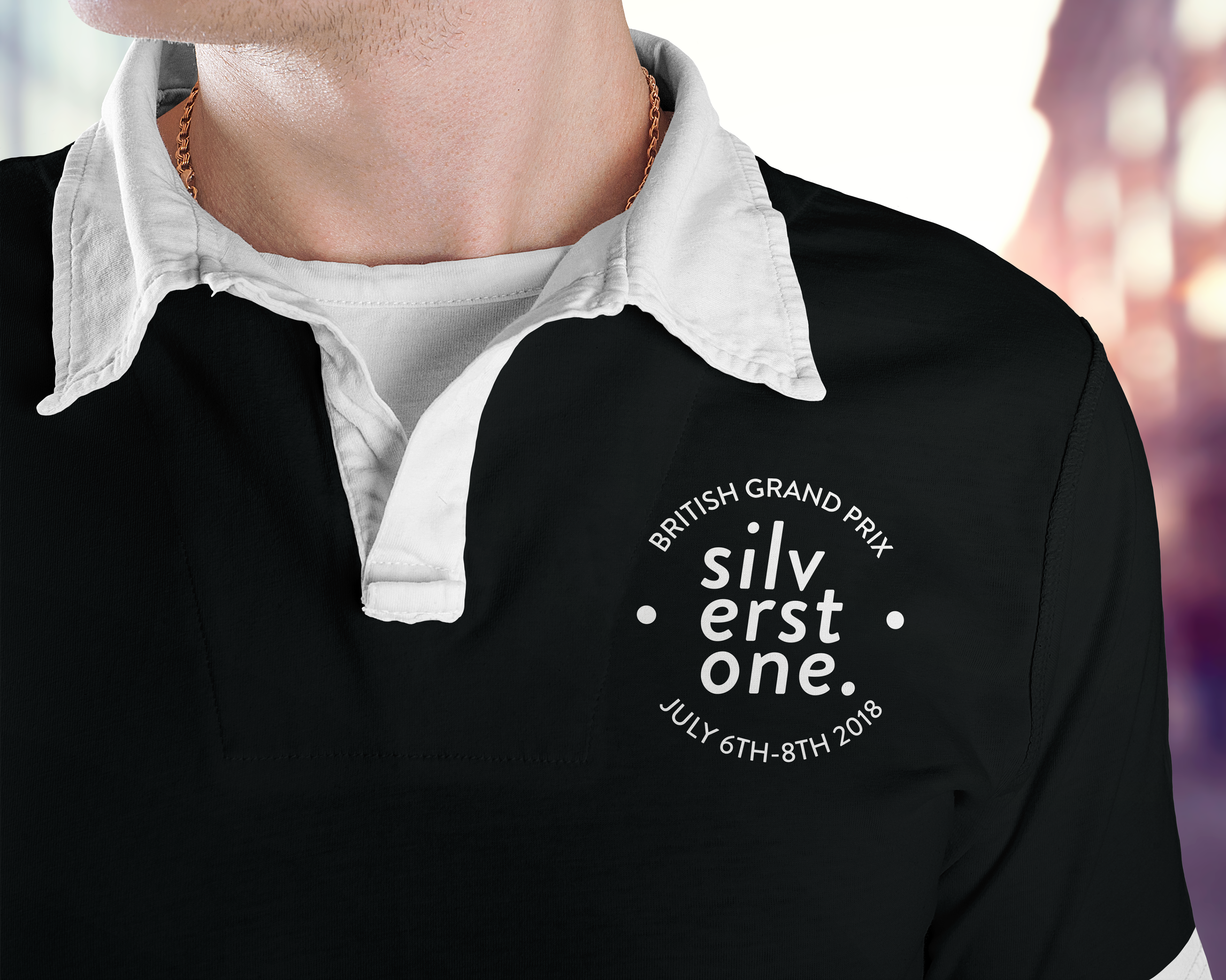
This design was compatible for both the Core range and the Grand Prix range. The Grand Prix range features the addition of the text around the badge on the front, and the back shows a large ‘18’ print.
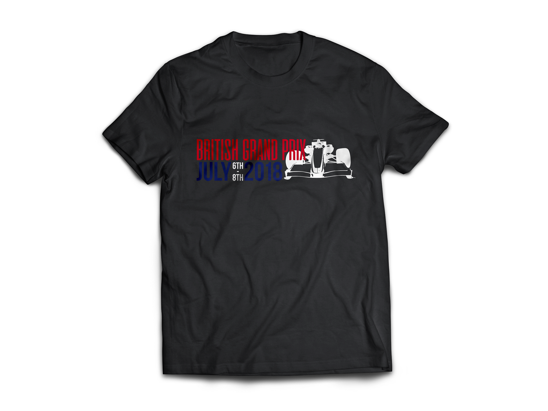
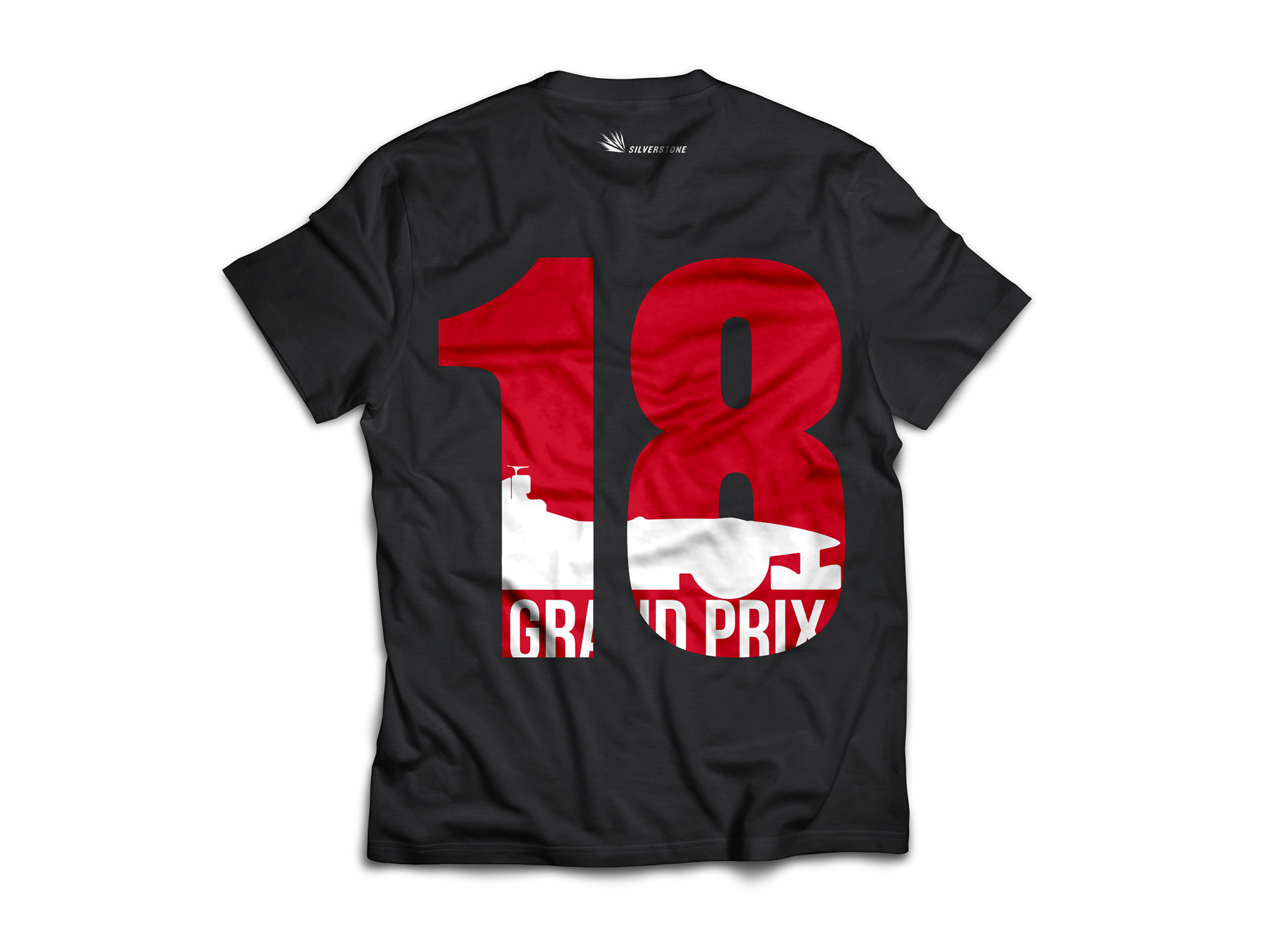
Through my research, I found t-shirts with large numbers printed on the back were popular in high-street fashion and they resembled shirts worn by team players. Therefore, I thought for the Grand Prix range, it would look bold on the back and to contrast that, I created a simple design on the front of the shirt featuring an race car vector.